Model Outline of TherMap 3.0
The idea behind these developments was to calculate thermal maps on the basis of an empirical model, such as the one outlined below. Observing the ease with witch birds and experienced glider pilots interpret the topology of a region seemed to indicate that such models must exist. The stepwise development itself took however several years. But finally hundreds of validations with actual flight records confirmed their validity. A particular advantage of this approach is that the maps also show the thermal potential of less visited regions.
On the occasion of the Opening of the Gliding World Championships at Lüsse/Berlin, Germany, OSTIV considered TherMap to be "a quantum leap in analizing and optimizing flight paths in known and unknown orographies".
1. Irradiance Maps
Digital elevation models (DEM), such as the worldwide 90m SRTM satellite models, provide a relatively detailed topographical profile of the surface of the earth. Extracts of these files can be used to determine the vertically projected irradiance of each raster field on a given date and daytime, which can then be visualized on corresponding irradiance maps.
Thermals are part of the atmospheric energy flow caused by solar irradiation. The results have shown that irradiance maps can be used to predict where thermals are likely to occur, particularly during the morning hours of Alpine regions.
Irradiance maps, however, show an instant situation, whereas heating up the surface and the air causing the thermals takes time. This becomes evident during the afternoon hours. There temperature maps expressing how much heat has been accumulated at a given place and time seemd to be a better indicator for the occurrence of thermals.
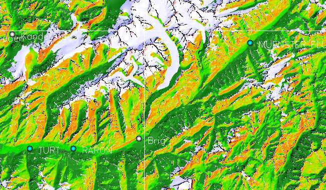
Region of Aletsch glacier on
June 20, 10.00h UTC: The intensities are from green via yellow to red.
The white spots are expected thermal takeoff points
2. Temperature Maps
For practical reasons TherMap computes
the heat accumulation at the surface using a relatively simple empirical
smoothing algorithm, to approximate the evolution of the surface temperature
at the usual flight altitudes. To simulate the effect of the actual
orography Thermap considers the cooling effect of calculated forest
areas and seasonal vegetation, and makes an approximation for the effect
of snow and permafrost surfaces. With these adjustments the resulting
temperature maps seemed to be more plausible predictors of the location
of thermals during the afternoon hours.
To validate and refine the maps, IGC-flight tracks have been superimposed,
using colour codes to distinguish between climbing and descending flight
phases. This way the agreement between the hotspots and their influence
on the flights could be visualized. The map extract shown below, of
a flight across the Aletsch glacier region, illustrates that the climbing
phases coincide very well with the yellow/red hotspots.
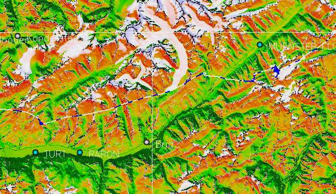
Temperature map of Aletsch glacier
region on June 28, 12.00h UTC.
Note the high level of agreement with the superimposed flight path (blue
= climbing, white = sinking)
In his publications the German glider pioneer Jochen von Kalckreuth mentioned that thermals on slopes exceeding about 25 to 30 degrees tend to climb along the slope until they reach a smaller slope or an edge. TherMap also considers the snow and permafrost limits, where thermals climbing along the slope meet the cold air coming from above, an additional reason causing thermals to take off.
![]()
3. Thermap Pressure
Irradiance and temperature maps basically show evenly distributed irradiance or temperatures across mountain sides with constant orientation and slope. During hot afternoon hours the maps therefore tend to be overloaded with hot spots and too blurred for gliding purposes. This problem also persists if all but the hottest spots are masked out. With the thermal pressure maps, TherMap could finally overcome these weaknesses.
The idea of the thermal pressure is based on the insight that any air "bubble" heated above a slope develops a lift force which can be decomposed into two components, namely one along the line of steepest ascent of the slope, and one perpendicaular to the slope. The first one creates a static pressure along the line of steepest ascent. This pressure is basically distributed proportional to the slope angle, but diminishing slowly with the distance from the original bubble, until the residual pressure falls below a critical value or until a takeoff point is reached. The initial lift of the bubbles is derived from the temperature maps, from which the thermal pressure maps can then be derived in an additional computation run based on the principles just described.
The resulting thermal pressure maps show the local potential for thermalsare indded more precisely. The following picture illustrates that thermal pressure maps even provide detailed results for southward facing slopes on hot summer afternoons.
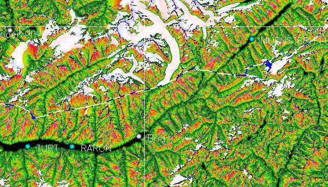
Thermal pressure map of June 28,
12h UTC, with the same flight track. The thermal hotspots are shown
far more precisely
than on the corresponding temperature map, as one can see by moving
the cursor on the image in order to see the original map.
![]()
4. Basic Backdrop Filter
Despite the precision of the thermal pressure maps, one of their limitations is that part of the areas shaded in green, which have a lower thermal potential, is somewhat redundant. This limits their readability which becomes particularly obvious when generating maps for more southern regions such as the US Sierra Nevada. Since purely topographic maps with a sun elevation of about 22 degrees are easy to read, it turned out to be better to replace part of the less interesting green areas of the thermal pressure maps by the corresponding topographic backdrop view based on the same sun azimuth as the one used for the thermal pressure, but with a constant sun elevation of 22 degrees. Using the same azimuth ensures consistent visual information and the relatively low sun elevation creates good shading contrasts for the topographic backdrops.
Filtered thermal pressure map for
the same region on July 1, 13h UTC. The filtered map is more
readable and contains all the relevant information concerning the thermal
pressure distribution.
![]()
5. Local Filter Limits
Practical experience shows that in some places the thermal potential is more clustered than shown on the maps of TherMap-2. Thermals are the result of local air circulation. In other words, the air uplifted in a thermals must be replaced by air flowing downwards in its vicinity, no matter how strong the thermal is. The strongest thermals even tend to suck in the air of smaller neighbouring thermals. In oder to account for such local effects, a local filter has been indroduced in Thermap-3. This filter functions as follows: For each area of about 0.8 km2 the surface grid cells (about 90m x 90m) are sorted according their thermal potential. The top cells accounting for 50 percent of the thermal potential of the local reference area are then determined. Only these top cells are finally displayed on the maps.

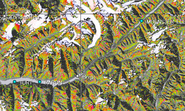
Thermal pressure map with local filter
for Aug 15, 12h UTC. The topography becomes more visible whereas the
hotspots are more focussed.
It may therefore be necessary to copy the map images in order to be
able to zoom in as appropriate.
![]()